Cisco AppDynamics
AppD Cloud Temporal Comparison Workflow
During a 12-week internship at AppDynamics (now Splunk), I led end-to-end design on a time comparison workflow for their Application Performance Monitoring environment: from user research and problem definition through wireframes and prototyping, all within AppDynamics' existing design system.
Role
Product Designer, UX Researcher
Tools
Figma, Procreate
Timeline
12 weeks
01
Problem Statement
Comparing performance data across time is central to how DevOps engineers troubleshoot.
The core question: starting with time-based comparison as the foundation, how do we let users compare current performance against a relevant timeframe to surface outliers, patterns, and trends?
02
Research
Informational Interviews
Starting broader than the brief, I ran informational interviews with internal stakeholders to map the real shape of the problem before narrowing to temporal comparison.

Customer Pain Points
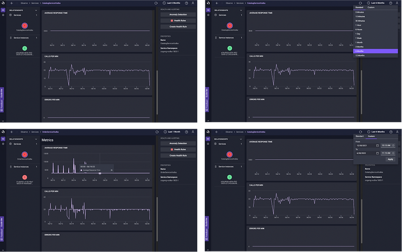
Current screenshots of the existing AppD Cloud platform.
Two themes emerged: first, users needed flexible ways to compare MELT data; across baselines, ad hoc issues, and version changes. Second, they felt constrained by the current tooling: the gap between what AppDynamics assumed users needed and what they actually needed was creating a sense of powerlessness.
Customer Pain Points
Two themes emerged: first, users needed flexible ways to compare MELT data; across baselines, ad hoc issues, and version changes. Second, they felt constrained by the current tooling: the gap between what AppDynamics assumed users needed and what they actually needed was creating a sense of powerlessness.
Competitive Analysis


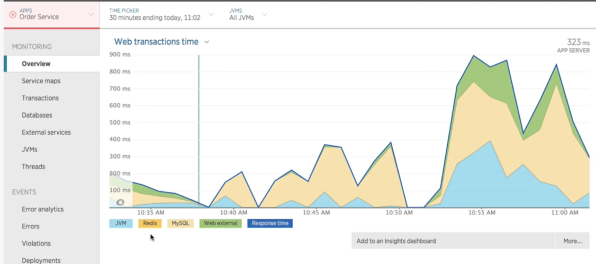

Looking at Lightstep, Datadog, and New Relic revealed a consistent pattern: all three surfaced comparison as a first-class action, not a buried setting.
Datadog handled comparison through a layered filtering system: tag grouping, aggregation types (avg, max, min, sum), and multiple graph views, all adjustable without leaving the main panel. Lightstep used a "Notebook" snapshot model with a dedicated comparison view triggered directly from the graph. New Relic offered function-based comparison across timeframes with a tabbed chart system for side-by-side views.
The common thread: comparison was always contextual, always close to where the user already was.
Customer Use Cases
Research surfaced four distinct comparison workflows users were already trying to perform: tag-based comparison, temporal comparison, release comparison, and metric analysis.
The current platform only supported a single global timeframe, where users had no native way to compare across any of these dimensions.
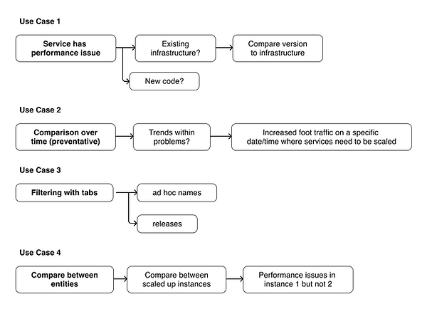
Final Use Case
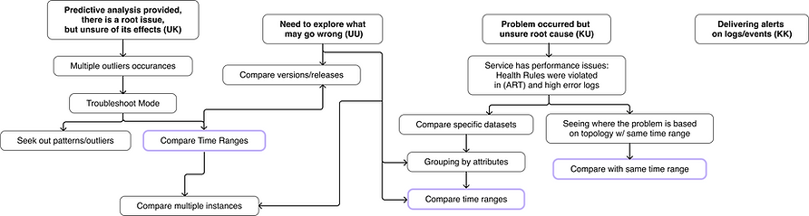
From my research, I learned a general time comparison workflow would support users more, as it would lead to a solution within multiple troubleshooting use cases.
03
Revisiting the Problem
The initial brief focused narrowly on temporal comparison. But research revealed something broader: time was just one dimension of a comparison problem that touched tagging, releases, and metric analysis too.
That created a real product decision: design a general comparison entry point flexible enough to serve all four use cases, or go deep on one to get it right first.
We focused on temporal comparison as the foundation, with the understanding that a well-designed time comparison workflow could establish the interaction patterns the other use cases would eventually inherit.
The design goal became answering three questions users ask in every troubleshooting session:
What has changed?
Where is the problem?
Why is it happening?
A DevOps engineer shouldn't have to leave their current context, switch tools, or manually piece together data across timeframes to answer any of these. The workflow needed to bring comparison to where they already were.
04
Ideation


A global header workflow would apply comparison across all datasets on a page simultaneously; the most desired option by stakeholders. A per-graph workflow scoped comparison to individual metric charts, giving users precise control without affecting their full view. And lastly, a hybrid workflow that applies comparison across all graphs on a page, but not the broader environment.
Feedback from stakeholders shaped the path forward:
The global header, while the desired goal, was not feasible at this stage. The clearer direction was to narrow scope, staying within MELT metrics, focusing on chart overlays, and accounting for baseline comparison as a key use case.
05
Prototypes & Testing
I moved forward with two workflows: the individual chart comparison and the hybrid page-level comparison. The individual workflow allowed for the most granular control, which is useful for deep analysis. The hybrid offered broader, faster access, which is better for rapid troubleshooting pattern research that had already surfaced.
Prototype Workflow 1A
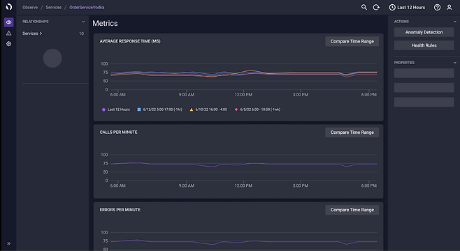

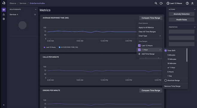
Focused on precision: multiple time range comparisons per chart, a toggleable dynamic x-axis to narrow focus, and customization patterns familiar to existing AppDynamics users.
Prototype Workflow 1B


Introduced editable timeline tabs with extra detail per time range, giving users more context without leaving the chart view.
Prototype Workflow 2
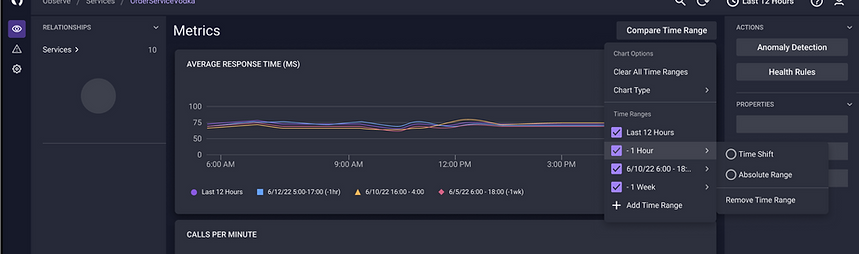
Higher level, rapid access to time shift customization across all graphs simultaneously with minimal clicks.
Video Walkthrough of All Workflows
Testing Feedback
To validate both directions, I ran structured internal interviews across four teams: Product Design Engineering, Customer Ops/Infrastructure Engineering, Product Reliability Engineering, and Site Reliability Engineering.
The interview was conducted in three parts: understanding each interviewee's background and troubleshooting workflow, walking through the prototypes and collecting design feedback, and closing with a usability questionnaire.
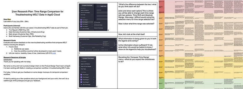
To validate both directions, I ran structured internal interviews across four teams: Product Design Engineering, Customer Ops/Infrastructure Engineering, Product Reliability Engineering, and Site Reliability Engineering.
The interview was conducted in three parts: understanding each interviewee's background and troubleshooting workflow, walking through the prototypes and collecting design feedback, and closing with a usability questionnaire.
Results across 7 participants (6 sessions):
Ease of use: 3.4 / 5
Usefulness 4.3 / 5
Workflow 2 aligned mostly with user expectations with the fewest clicks to get there. The main fiction point across both workflows was the time axis: users found it rather confusing and the level of customization offered was more granular than they actually needed.
What this told us: users weren’t looking for minute control over time ranges. They wanted to quickly scan and have fast access to defaults (1 hour ago, 1 day ago, 1 week ago, 1 month ago). Clear language, fewer decisions, and broader metric control mattered more than flexibility. The usefulness score confirmed the concept was right; the ease of use score showed exactly where to focus next.
08
What's Next?
Testing confirmed the concept, as users found it useful, but pointed to two clear areas to improve: time axis readability and terminology clarity. The immediate next steps would be to refine the x-axis labeling, involving content designers to simplify language, and establishing default time ranges based on how users actually troubleshoot.
Longer term, the workflow opens the door to deeper root cause analysis: comparing patterns across CPU, memory, and garbage collection across pods, and a more extended competitive analysis to ensure the interaction pattern holds up against industry standards.